Installing Rpy2 in Linux Mint

While installing Rpy2 on Linux Mint 17, I ran into the same problem described here. This was apparently a StackOverflow question at some point, but it was removed for some reason. Here’s my solution.

R version: 3.0.2
Python version: 2.7.6

Initially, I tried

$ pip install readline
$ pip install rpy2

But got the following (abridged) error.

/rpy/rinterface/_rinterface.c:86:31: fatal error: readline/readline.h: No such file or directory
#include <readline/readline.h>
compilation terminated.
error: command 'x86_64-linux-gnu-gcc' failed with exit status 1
----------------------------------------
Cleaning up...
UnicodeDecodeError: 'ascii' codec can't decode byte 0xe2 in position 79: ordinal not in range(128)

Although the Rpy2 documentation just lists “readline” as a dependency, the python readline package is not sufficient. Instead try

$ sudo apt-get install libreadline-dev
$ pip install rpy2

Posted in Uncategorized | Leave a comment

Implementing the Chaudhuri-Dasgupta density cluster tree

A few months ago Siva Balakrishnan wrote a nice post on Larry Wasserman’s blog about the Chaudhuri-Dasgupta algorithm for estimating a density cluster tree. The method, which is described in a NIPS 2010 paper “Rates of convergence for the cluster tree” (pdf link), is conceptually simple and supported by nice theoretical guarantees but somewhat difficult to use in practice.

As Siva described, clustering is a challenging problem because the term “cluster” is often poorly defined. One statistically-principled way to cluster (due to Hartigan (1975)) is to find the connected components of upper level sets of the data-generating probability density function. Assume the data are drawn from density f and fix some threshold value \lambda, then the upper level set is \{x: f(x) \geq \lambda \} 
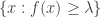
and the high-density clusters are the connected components of this set. Choosing a value for \lambda is difficult, so we instead find the clusters for all values of \lambda \geq 0. The compilation of high-density clusters over all \lambda values yields the level set tree (aka the density cluster tree).

Of course, f is unknown in real problems, but can be estimated by \widehat{f}. Unfortunately, computing upper level sets and connected components of \widehat{f} is impractical. Chaudhuri and Dasgupta propose an estimator for the level set tree that is based on geometric clustering.

  1. Fix parameter values k and \alpha.
  2. For each observation x_i, i = 1,\ldots,n, set r_k(x_i) to be the distance from x_i to x_i‘s (k-1)‘th closest neighbor.
  3. Let r grow from 0 to \infty. For each value of r:
    1. Construct a similarity graph G_r with node set \{x_i: r_k(x_i) \leq r\} and edge (x_i, x_j) if \|x_i - x_j\| \leq \alpha r.
    2. Let \widehat{C}(r) be the connected components of G_r.

Chaudhuri and Dasgupta observe that for single linkage \alpha=1 and k=2. The connected components \widehat{C}(r) also form a tree when compiled over all values of r, which is the estimated level set tree.

Using this estimator in practice is not straightforward, due to the fact that r varies continuously from 0 to \infty. Fortunately, there is a finite set of r values where the similarity graph G_r can change. Let W be the set of edge lengths in the complete graph (aka G_\infty), and let W_\alpha be the set W with each member divided by \alpha. Then G_r can only change at values in the set

R = W \bigcup W_\alpha.

The vertex set changes when when r is equal to some edge length, because as r grows, node i is first included in G_r precisely when r = r_k(x_i) which is the k‘th smallest edge length incident to vertex i. Similarly, the edge set changes only when r is equal to an edge length divided by \alpha, because edge (i,j) is first included in G_r when \alpha r = \|x_i - x_j\|, which only happens if r = w_{ij}/\alpha.

An exact implementation of the Chaudhuri-Dasgupta algorithm starts with r equal to the longest pairwise distance and iterates over decreasing values in set R. At each iteration, construct G_r and find the connected components. To illustrate, I sampled 200 points in 2-dimensions from a mixture of 3 Gaussians, colored here according to the true group membership.

cd_tree_data

cd_tree
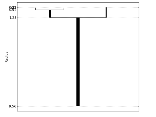
The second figure is a visualization of the Chaudhuri-Dasgupta level set tree for these data. Vertical line segments represent connected components, with the bottom indicating where (in terms of r) the component first appears (by splitting from a larger cluster) and the top indicating where the component dies (by vanishing or splitting further). The longer a line segment, the more persistent the cluster. The plot clearly captures the three main clusters.

There are many ways to improve on this method, some of which are addressed in our upcoming publications (stay tuned). A Python implementation of the Chaudhuri-Dasgupta algorithm will be available soon. In fact, the code is already available at https://github.com/CoAxLab/DeBaCl/ in the “develop” branch. Accompanying demos, tutorials, and documentation will be posted shortly.

References

  • Chaudhuri, K. and DasGupta, S. (2010). Rates of convergence for the cluster tree. Advances in Neural Information Processing Systems, 23, 343–351.
  • Hartigan, J. (1975). Clustering Algorithms. John Wiley & Sons.
Posted in python, research | 2 Comments

Getting started with statistical computing in Python

The world hardly needs yet another tutorial on statistical computing with Python, but I made one for a live demo and I might as well post it. Also, the IPython Notebook makes me happy.

http://nbviewer.ipython.org/urls/raw.github.com/papayawarrior/public_talks/master/statBytes-python.ipynb

In a very loose sense, the topics are:

  • what packages are in the Python statistical computing ecosystem
  • how to install Python packages
  • generating and plotting very simple data
  • ordinary least squares
  • reading and summarizing data with pandas
  • 3D plotting with matplotlib
  • applying algorithms from scikit-learn
  • resorting to R functions (if necessary) with Rpy2
Posted in python | Leave a comment

tapply in Python

tapply is a super convenient function in R for computing statistics on a “ragged array”. It lets you separate a dataset into groups based on a categorial variable, then compute any function you want on each group. Suppose we have the following made-up data

name state age
alice maine 26
bob washington 23
claire california 28
david florida 26
ellen florida 23
frank maine 25
gina texas 20
jerome maine 26
kira texas 26
larry washington 19

stored in an R data frame called roster. If we want to figure out the maximum age in each state we can use tapply:

max_age = tapply(roster$age, INDEX=roster$state, FUN='max')
print(max_age)
california 28
florida 26
maine 26
texas 26
washington 23

One of the annoying parts of switching from R to the Python/Numpy/Scipy universe is the lack of a tapply analog. The Python Pandas library solves the problem, quite smoothly. Suppose the data is saved in the file ‘ages.csv’.

import pandas as pd
roster = pd.read_csv('ages.csv')
grouped = roster.groupby('state')
age_max = grouped.max()
print age_max
name age
state
california claire 28
florida ellen 26
maine jerome 26
texas kira 26
washington larry 23

This is the “split-apply-combine” paradigm in Pandas. The grouped object in my example above comes with several built-in functions for standard counting and statistics:

size – gives the number of rows in each group
groups – row indices belonging to each group
min, max
mean, median
sum, prod – sum and product
var, std

For more complicated functions, or when other arguments need to be passed, there are a few options. The least elegant is to simply loop through the groups, doing the desired function within the loop.

for state, record in grouped:
    print state
    print record
    print

returns

california
     name       state  age
2  claire  california   28

florida
    name    state  age
3  david  florida   26
4  ellen  florida   26

maine
     name  state  age
0   alice  maine   26
5   frank  maine   25
7  jerome  maine   26

texas
   name  state  age
6  gina  texas   20
8  kira  texas   26

washington
    name       state  age
1    bob  washington   23
9  larry  washington   19

A more elegant solution is to use a lambda function within the aggregrate method.

quintile = grouped.aggregate(lambda x: np.percentile(x, 20))
print quintile
age
state
california 28.0
florida 26.0
maine 25.4
texas 21.2
washington 19.8

For more on the split-apply-combine framework, see the Pandas documentation and various blog posts [1] [2].

Posted in python | Leave a comment

Stat programming workshop – tutorial for a very simple R choropleth map

Eye candy is the best way to get your poster noticed at a conference and choropleth maps are some of the tastiest morsels. Here’s a quick tutorial on how to make one in R. It’s not a beginner topic, so bear with it. The approach below probably requires the least overheard in terms of new libraries or plotting paradigms, but it is also probably the least powerful method.
-Brian

  1. Install the maps library. The command install.packages("maps") usually does the trick, although I’m not too familiar with non-linux environments.
  2. Load the necessary libraries and data objects. The last line loads the state names and some data to play with.
    library(maps)
    data(state)
  3. Make a basic map, just to see how it looks.
    map("state", fill=FALSE, boundary=TRUE, col="red")
  4. Now come the hard parts. Presumably you want to color each state according to some numerical variable. I’m going to use land area, which is called state.area (loaded in step 2). The problem is that the map command actually draws 63 regions that comprise the continental US, while our data vector has one entry for each of the 50 states.
  5. To get the 63 regions, make an invisible map.
    mapnames <- map("state", plot=FALSE)$names
  6. Note that each region’s name is either a state or a state followed by a colon and then an island. We’ll use the colon to isolate the state names.
    region_list <- strsplit(mapnames, ":")
    mapnames2 <- sapply(region_list, "[", 1)
  7. Now we need to match our data to the state names as they appear in the map.
    m <- match(mapnames2, tolower(state.name))
    map.area <- state.area[m]

    Now each of the 63 regions is associated with the land area corresponding to its state (except poor Washington, DC, which is missing from the original state.area variable).
  8. The next step is to define the colors for our map. Of the basic R palettes, I think the heat.colors() look best. I use 8 colors; use a higher number if you want more subtle distinctions. I also reverse the color vector so that higher land area states show up redder.
    clr <- rev(heat.colors(8))
  9. Now we need to collapse our map areas into bins, one per color.
    area.buckets <- cut(map.area, breaks=8)
  10. And finally, for all the glory…
    map("state", fill=TRUE, col=clr[area.buckets])

Posted in teaching | 3 Comments

Stat programming workshop – week 6 tasks

April 2013 update: this post is part 6 of 6 that were designed to help beginning R programmers get up and running with some simple data analyses. They were originally private for a specific course in Summer 2012, but they’re now public in case the tips might be useful for a broader audience. -Brian

In week 6 we look at loops in R and how to avoid them at all costs. If you’ve had some programming experience in other languages like C, C++, or python you know that looping is an important part of many programs, but looping in R is really slow. When dealing with large data sets it becomes really important to avoid loops so your programs finish in a reasonable amount of time. Fortunately R has several built-in functions that are very good at replacing loops, although it is tricky to learn to think in R’s “vectorized” fashion.
-Brian

  1. The first task is to get the average of each row in a matrix.Create a 10 x 5 matrix:
    m = matrix(1:50, nrow=10, byrow=T)
  2. Use a for loopto find the row averages. Here’s how I would do it:
    avg = rep(NA, 10)
    for(i in 1:10) {
        avg[i] = mean(m[i,])
    }
  3. The apply function allows us to avoid the for loop in this case. Check the help file for apply then use it to find the row means. Make sure the answer is correct.
    avg = apply(m, 1, mean)

    Note the second argument is a 1 (instead of a 2) because we want to apply the function mean to each row of our matrix. Making this a 2 would find the column means.

  4. For common operations, R often has built-in functions that accomplish the task most efficiently. In this case we can use the function rowMeans to do this job.
    avg = rowMeans(m)
  5. The second task is to compute statistics about a data set arranged as a “ragged array”. The cars data set that we’ve used in previous weeks is a good example of this. Suppose we want to find the mean gas mileage for each year. This is a ragged array because there are a different number of rows for each of the years.
  6. Use the table command to confirm to get a list of the years and the number of observations for each year.
  7. Think about how you would use a for-loop to find the mean gas mileage for each year. It’s kind of a pain.
  8. The tapply command is more elegant and much faster than the for-loop solution, so let’s use that instead. Look up the command’s help file, and use it to find the mean mileage for each year.
    avg = tapply(cars$mpg, INDEX=cars$year, FUN=mean)
Posted in teaching | Leave a comment

Stat programming workshop – week 5 tasks

April 2013 update: this post is part 5 of 6 that were designed to help beginning R programmers get up and running with some simple data analyses. They were originally private for a specific course in Summer 2012, but they’re now public in case the tips might be useful for a broader audience. -Brian

This week’s focus is on estimating and plotting a linear regression.
-Brian

  1. Load the cars data from previous weeks and name the variables (see the week 3 tasks for details).
  2. We want to explore the relationship between engine displacement (which I assume is an indicator of an engine’s size) and gas mileage. Make a scatterplot of mileage (‘mpg’) against engine displacement (‘displacement’).
  3. Fit a linear regression of gas mileage on engine displacement. If you are familiar with linear regression, awesome. If not, think of it as the line that best fits the data points you just plotted. The command to do this is lm, which is short for linear model. We want to save the output so we can access it later, so we assign it to a new variable (I call mine ‘fit’): fit = lm(cars$mpg ~ cars$displacement).
  4. Display the results of the regression. The quick way to do this is with the summary(lm) command.
  5. Add the regression line to your plot. If your plot is still open, the command abline(fit) is built to do this automagically. Make the line red and thicker for easier viewing.
  6. The ‘fit’ object now has a bunch of stuff in it. Use the command names(fit) to list this stuff. Any of these objects can be accessed with the $ operator. Make a plot of the regression residuals compared to displacement. plot(cars$displacement, fit$residuals).
  7. Bonus: Access the standard error of the intercept term. Hint: the ‘summary(lm)’ output can also be treated as an object, whose attributes can be accessed with the $ operator.
Posted in teaching | Leave a comment

Stat programming workshop – week 4 tasks

April 2013 update: this post is part 4 of 6 that were designed to help beginning R programmers get up and running with some simple data analyses. They were originally private for a specific course in Summer 2012, but they’re now public in case the tips might be useful for a broader audience. -Brian

In weeks 1-3 we installed and opened R, imported data from a text file, and started editing and saving code in source files. This week’s focus is R’s basic plot functions. One of the most important parts of any statistical analysis is communicating the results to other people, and plots are often a very effective way to do this.
-Brian

  1. Open R and load the car data from weeks 2 and 3. Name the variables in the car data appropriately (see the week 3 tasks for the variable names).
  2. Last week we used the table command to see how many cars there are in our data set for each number of cylinders. Now we’ll check out the same information visually, using the command hist to produce a histogram. In the command window, type hist(cardata$cylinders).
  3. Save this plot, by using a sequence of three commands: 1. png([filename].png); 2. hist([some variable]); 3. dev.off(). If you want a pdf file instead of a png image, you can substitute the command pdf in place of png. Similarly, we will work with various plot commands in addition to hist; just substitute your command in place of hist.
  4. Figure out how to make the plot pretty: change the default title, and axis labels. Hint: use the help(hist) command to see descriptions of the arguments to hist.
  5. Now make a histogram of the weight variable. Notice that hist chooses a default number of break points, because the weights don’t naturally fall into a nice number of bins like the number of cylinders. Re-do the plot with 20 bins.
  6. Suppose we want to investigate how mpg changes over the years. Make a scatterplot of mpg vs year with the plot(year, mpg) command.
  7. Bonus: Add a horizontal line to the plot that shows where the overall mean of mpg is. Use the command abline(h=mean(cardata$mpg)). Try to make this line thicker than the default, and try to make it red (default is black).
Posted in teaching | Leave a comment

Stat programming workshop – week 3 tasks

April 2013 update: this post is part 3 of 6 that were designed to help beginning R programmers get up and running with some simple data analyses. They were originally private for a specific course in Summer 2012, but they’re now public in case the tips might be useful for a broader audience. -Brian

In week 1 we looked at installing and running R, while week 2 focused on importing data. This week we start exploring how to write re-usable R code.
– Brian

  1. There are many advantages to doing statistical analysis with a programming language like R. Obviously, we use it to make the computer do what we want, but more importantly R enables us to write reusable code. This means a couple things: first, we want to be able to come back and run our programs long after we wrote them; second, we want to save time by not re-writing everything from scratch for each analysis; and lastly we want our analyses to be reproducible by other researchers.
  2. Open R, and open the text editor of your choice. If you’re using R on Windows or Mac you can use R’s built-in text editor. On Macs, go to File >> New Document. It should be similar in Windows. You can also use a separate text editor like Notepad (windows), gedit (linux), or TextEdit (mac).
  3. Enter the code for opening the car MPG data (from week 2 – you should have it saved as ‘cars.txt’) in the new document. cardata = read.table(‘cars.txt’)
  4. On the next line edit the names of the variables in the cardata data frame. names(cardata) = c(‘mpg’, ‘cylinders’, ‘displacement’, ‘horsepower’, ‘weight’, ‘acceleration’, ‘year’, ‘origin’, ‘name’)
  5. On the next line compute and display a table that shows the unique values in the cylinders column, and how many observations there are for each number of cylinders. print(table(cardata$cylinders)). Note the $ syntax to refer to a variable name in the cardata data frame.
  6. Save your program with a .R extension. For example, mine is called “mpg_analysis.R”.
  7. Run your program. Switch back to the R command line and type source([your program name]). For me, this is source(‘mpg_analysis.R’). You should see the table of cylinder values and counts come up.
Posted in teaching | Leave a comment

Stat programming workshop – week 2 tasks

April 2013 update: this post is part 2 of 6 that were designed to help beginning R programmers get up and running with some simple data analyses. They were originally private for a specific course in Summer 2012, but they’re now public in case the tips might be useful for a broader audience. -Brian

Hopefully after working through last week’s tasks you have installed R, can open R, and can look up help files for new commands. This week’s tasks are intended to lead you through importing a data set and computing some basic summary statistics.
– Brian

  1. Copy the car MPG data at http://archive.ics.uci.edu/ml/machine-learning-databases/auto-mpg/auto-mpg.data and paste it into a text file. Save the file as “cars.txt”.
  2. Open R and change the working directory to the location where “cars.txt” is saved. Hint: the setwd() is what you want for this, and the getwd() command can be used to check that you’re in the right directory. List the files in the directory with the dir() command to make sure “cars.txt” is there.
  3. Import the data in “cars.txt” into R with the read.table() command. cars = read.table(“cars.txt”)
  4. How many rows of data are there? How many variables? Hint: check out the dim() command.
  5. View the first 10 rows of the cars data.
  6. The second variable (called “V2” unless you’ve already added column names) has integer values. Figure out what the unique values are for this variable. Hint 1: check out the unique() command. Hint 2: to access an individual column of our data set use the $ operator. For example, to get the unique values of variable 8, you could do unique(cars$V8).
  7. Bonus: How many rows are there for each value of variable 2?
Posted in teaching | Leave a comment